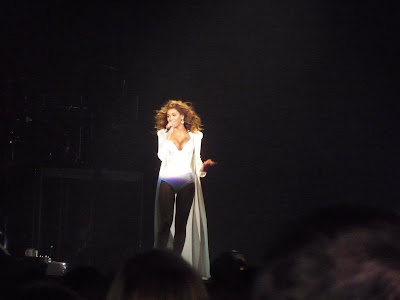
I went to a Beyonce concert last year by having really good seats i took some really clear images and thought they would be ideal to use as they had to be my own photo's but wanted to put a well known artist on the cover as it would be a new magazine a famous artist for the first issue would be a fantastic selling point. I also wanted the pictures to have a variety of different camera shots otherwise everything would just look the same. I also used photographs from a holiday and from shots at school and the school fashion show so there was different people in the images rather than it all being the same person.
Front Cover

From the concert this is my favorite image, the way the light hits the people shows a contrast and for fans of Beyonce could show her alter ego the light and dark, its such a statement picture i thought it was eye catching and intriguing and a fantastic photograph for the front cover.
Advertisement Page
Instead of leaving the page blank i decided to fill the page with something related rather than a product of some for, i decided to do a page on upcoming concerts and an opportunity for the reader to win tickets to a concert. For this i decided to use this image.

Contents Page


I used these photographs from my school fashion show as i wanted to do a piece in my contents page on the deceased Michael Jackson and these photo's were taken during a Michael Jackson song, the outfit and poses fit perfectly with what MJ was well known for.

This photograph is from a shoot we done at school for a project with me and some friends, i thought they would work great as a new girl band.

I have done an page in my magazine about the 'hottest' places in Ibiza, i thought that this picture from the beach would be a good one to use as during the days in Ibiza most people hit the beach, its all part of the holiday.
Double Page Spread Images

I really liked this close up side shot and thought it would be perfect to use as my main picture on my double page spread, i decided that the main picture would cover the whole of the right hand page. This is because when flicking through the magazine you always look to the right and it is a very dominant eye catching photo and i feel that by having it on a page by itself would be better otherwise people won't read much of the text as they are too busy looking at the photograph.


These picture's are distant shots i liked how the dark black ground contrasts with the brightness of her white dress, i thought these would be a good thumbnail image's to use.
No comments:
Post a Comment