Magazine Analysis
I chose to analyse two magazines from different genre's as the magazine i am producing is not focused on one particular genre but will feature aticles and news about different artists to give a wide variety and different information. Some people are not fixed on one specific genre or style of music and like a mixture of everything, but music magazines available on the market today usually follow one general style or genre. I found a gap in the market and wanted to create a magazine that had a little bit of everything in it so i looked at two contrasting magazines to get an idea of what both magazines portray.
Friday, 7 May 2010
NME Magazine Analysis
NME Magazine Analysis
New Musical Express (better known as the NME) is a popular music magazine, it has been published weekly since March 1952. It was the first British paper to include a singles chart, which first appeared in the 14 November 1952 edition.

1. The collage of the different bands exploding out of the main titel "The Albums of 2010" this is attractive to the readers as it appears that the magazine is packed with all there favorite bands over numerous articles.
2. "2010" is the biggest word on the page, the main headline, the magazines biggest selling point and the biggest part of this issues magazine.
3. NME is in bold font in red capital letters with a white outline it makes the title stand out against the black background of the name.
4. The colour scheme is mainly red, white and black with a black boarder of the magazine, this links with the genre of a rock magazine.
5. The strapline; the use of repitition of the Albums of 2010 as a main selling point, also the use of the word 'ultimate' is persuasive to the reader encouraging them to buy it, as they wont get whats inside this magazine anywhere else.
6. All the artists are from the rock/indie genre, they are holding guitars and most of the men have long hair, these are general traits linked with that genre.
Tuesday, 20 April 2010
Vibe Magazine Analysis
Vibe Music Magazine
Vibe is a music and entertainment magazine founded by producer Quincy Jones. The magazine is based on R&B and hip-hop music artists, actors and other entertainers. The magazine comes out quarterly, the magazine's target audience is young, urban followers of hip-hop culture around the age of 16-25.
Vibe is a music and entertainment magazine founded by producer Quincy Jones. The magazine is based on R&B and hip-hop music artists, actors and other entertainers. The magazine comes out quarterly, the magazine's target audience is young, urban followers of hip-hop culture around the age of 16-25.


All Vibe magazines share the same key similarities;
1. They all have a well known famous Hip-hop or R&B artist as there main focus of attention on the front cover.
2. The backgrounds remain simple and usually just a colour, so it doesn't draw the attention away from the main focus (the artist), the background also reflects there gender, harsh darker colours are used for the men, to withhold there strong image and represent their masculinity and the lighter softer colours used for women which shows femininity.
3. The names of the artists are written in big bold letters, this lets the audience identify who the artist is if they wasn't sure by the picture, although they expect you to know the main artists of the Hip-hop and R&B industry as thats the people who usually purchase the magazine so they expect some knowledge of the genre.
4. The Masthead is always written in the same font style, but the colour varies depending on the background and other fonts.
5. The artists are all from the Hip-hop/R&B background.
Monday, 19 April 2010
My Photography
My Photography
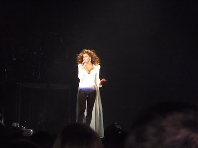
I went to a Beyonce concert last year by having really good seats i took some really clear images and thought they would be ideal to use as they had to be my own photo's but wanted to put a well known artist on the cover as it would be a new magazine a famous artist for the first issue would be a fantastic selling point. I also wanted the pictures to have a variety of different camera shots otherwise everything would just look the same. I also used photographs from a holiday and from shots at school and the school fashion show so there was different people in the images rather than it all being the same person.
Front Cover

From the concert this is my favorite image, the way the light hits the people shows a contrast and for fans of Beyonce could show her alter ego the light and dark, its such a statement picture i thought it was eye catching and intriguing and a fantastic photograph for the front cover.
Advertisement Page
Instead of leaving the page blank i decided to fill the page with something related rather than a product of some for, i decided to do a page on upcoming concerts and an opportunity for the reader to win tickets to a concert. For this i decided to use this image.

Contents Page


I used these photographs from my school fashion show as i wanted to do a piece in my contents page on the deceased Michael Jackson and these photo's were taken during a Michael Jackson song, the outfit and poses fit perfectly with what MJ was well known for.

This photograph is from a shoot we done at school for a project with me and some friends, i thought they would work great as a new girl band.

I have done an page in my magazine about the 'hottest' places in Ibiza, i thought that this picture from the beach would be a good one to use as during the days in Ibiza most people hit the beach, its all part of the holiday.
Double Page Spread Images

I really liked this close up side shot and thought it would be perfect to use as my main picture on my double page spread, i decided that the main picture would cover the whole of the right hand page. This is because when flicking through the magazine you always look to the right and it is a very dominant eye catching photo and i feel that by having it on a page by itself would be better otherwise people won't read much of the text as they are too busy looking at the photograph.

These picture's are distant shots i liked how the dark black ground contrasts with the brightness of her white dress, i thought these would be a good thumbnail image's to use.
I went to a Beyonce concert last year by having really good seats i took some really clear images and thought they would be ideal to use as they had to be my own photo's but wanted to put a well known artist on the cover as it would be a new magazine a famous artist for the first issue would be a fantastic selling point. I also wanted the pictures to have a variety of different camera shots otherwise everything would just look the same. I also used photographs from a holiday and from shots at school and the school fashion show so there was different people in the images rather than it all being the same person.
Front Cover

From the concert this is my favorite image, the way the light hits the people shows a contrast and for fans of Beyonce could show her alter ego the light and dark, its such a statement picture i thought it was eye catching and intriguing and a fantastic photograph for the front cover.
Advertisement Page
Instead of leaving the page blank i decided to fill the page with something related rather than a product of some for, i decided to do a page on upcoming concerts and an opportunity for the reader to win tickets to a concert. For this i decided to use this image.

Contents Page


I used these photographs from my school fashion show as i wanted to do a piece in my contents page on the deceased Michael Jackson and these photo's were taken during a Michael Jackson song, the outfit and poses fit perfectly with what MJ was well known for.

This photograph is from a shoot we done at school for a project with me and some friends, i thought they would work great as a new girl band.

I have done an page in my magazine about the 'hottest' places in Ibiza, i thought that this picture from the beach would be a good one to use as during the days in Ibiza most people hit the beach, its all part of the holiday.
Double Page Spread Images

I really liked this close up side shot and thought it would be perfect to use as my main picture on my double page spread, i decided that the main picture would cover the whole of the right hand page. This is because when flicking through the magazine you always look to the right and it is a very dominant eye catching photo and i feel that by having it on a page by itself would be better otherwise people won't read much of the text as they are too busy looking at the photograph.


These picture's are distant shots i liked how the dark black ground contrasts with the brightness of her white dress, i thought these would be a good thumbnail image's to use.
Sunday, 18 April 2010
Typography
Typography is the art and technique of arranging type. The arrangement of type involves the selection of typefaces, point size, line length, leading (line spacing), adjusting the spaces between groups of letters (tracking) and adjusting the space between pairs of letters (kerning).


Leading is also called "line spacing." Leading originally referred to strips of lead that typesetters placed between lines of type in order to space them out. When you're reading something, the spaces between the line you're reading and the lines above and below that line are supposed to guide your eyes from one line to the next.
Subscript and Superscript

A subscript or superscript is a number, figure, symbol, or indicator that appears smaller than the normal line of type; it is set slightly below or above it. Subscripts are at or below the baseline, whereas superscripts are always above.
Typography is the art and technique of arranging type. The arrangement of type involves the selection of typefaces, point size, line length, leading (line spacing), adjusting the spaces between groups of letters (tracking) and adjusting the space between pairs of letters (kerning).
Serif and Sans Serif
Serif fonts are usually easier to read than sans-serif fonts. This is because the ‘serif’ makes the individual letters stand out more and easier for our brains to recognize quickly. Without the serif, the brain has to spend longer recognizing the letter because the shape is less striking. Commonly for printed work the typeface to use a serif font for the body of the work and a sans-serif font is often used for headings and captions.
Serif fonts are usually easier to read than sans-serif fonts. This is because the ‘serif’ makes the individual letters stand out more and easier for our brains to recognize quickly. Without the serif, the brain has to spend longer recognizing the letter because the shape is less striking. Commonly for printed work the typeface to use a serif font for the body of the work and a sans-serif font is often used for headings and captions.
Serif - Serifs are thought to have originated in the Roman alphabet with inscriptional lettering—words carved into stone in the Roman period. There are many serif typefaces, some of the most commonly used today are, Times New Roman, Garamond, and Cambria.
Times New Roman is the most commonly used serif typeface which was commissioned by a British newspaper, The Times, in 1931, After just one year, the design was released for commercial sale. The Times stayed with Times New Roman for 40 years, but with new production techniques developing and the format change from broadsheet to tabloid in 2004 it caused the newspaper to switch font five times from 1972. Despite this all the new fonts have been only slightly different versions of the original New Roman font.
Sans Serif- In typography, a sans serif typeface is one that does not have the small features called "serifs" at the end of strokes. The term comes from the Latin word "sine", through the French word sans, meaning "without". In print, sans-serif fonts are more typically used for headlines than for body text. Some of the most commonly used sans serif typefaces used in present day are Arial, Verdana and Calibri.
Arial was originally known as Sonoran Sans Serif. It acquired its current name when Microsoft started to include it in Windows. The most commonly used sans serif typeface, arial is a computer font packaged with Microsoft Windows, other Microsoft software applications. Arial is also a typeface family which includes the common standard Arial (Arial Std) and other slightly different versions of the original, including Arial Black, Bold, Extra Bold, Condensed, Italic, Light, Medium, Monospaced, Narrow, and Rounded.


Base line: the imaginary line upon which all type rests on
X-height: the main part of the lower case which is equal to the height of the lowercase ‘x’
Ascender: the part of the letter form of the lower case which rises above the x-height as in ‘b’, ‘d’, ‘f’, ‘h’, ‘k’ or ‘l’
Descender: the part of the letter ‘g’, ‘j’, ‘p’, ‘q’ and ‘y’ that goes below the baseline
Cap height: height of the capital letter. The ascenders of some lowercase actually rises sometimes a little bit above the cap height.
Type size: refers to the overall depth of the typeface and is measured from the top of the highest character to the foot of the lowest.
Stroke or stem: vertical or oblique part of a letter. It can be more or less thick or thin.
Counter: An enclosed or partially enclosed portion of a type character such as ‘p’, ‘q’ or ‘b’
Kerning and Leading

Kerning adjusts the spaces between letters so that the placement appears to flow and be the same between each and every letter. Certain letter combinations such as Ta have too much space between them. With kerning, you can adjust the spacing to make letters closer together (or further apart) so that the words don't look jumbled.
Leading is also called "line spacing." Leading originally referred to strips of lead that typesetters placed between lines of type in order to space them out. When you're reading something, the spaces between the line you're reading and the lines above and below that line are supposed to guide your eyes from one line to the next.
Subscript and Superscript

A subscript or superscript is a number, figure, symbol, or indicator that appears smaller than the normal line of type; it is set slightly below or above it. Subscripts are at or below the baseline, whereas superscripts are always above.
Magazine Terminology
Masthead - The name and logo of the magazine. This is usually placed at the top of the front page and often includes an emblem or motto.
The Lead - The introductory paragraph of an article, usually written in bold or capitals.
Body copy - Refers to the text of your written articles, which should be produced as a printed presentation to accepted industry standards, e.g correct use of language, font size, word limits etc. Usually written in columns.
Serif font - Fonts like Times New Roman, or Baskerville Old Face, which have little bars (serifs) on the end of the letters.
Sans serif fonts - Fonts like Impact, or Agency FB, which do not have little bars on the end of the letters.
Drop Capitals - Really big letter that starts off an article.
Cross Head - Small sub heading used to split up a large block of text.
White Space - White parts of the page other than text or pictures.
Mode of address - How the magazine talks to the audience.
Sell lines - Text on the cover that helps to sell the magazine to the audience.
Banners - Text which stands out because its on a coloured background.
House Style - A magazines distinctive design that distinguishes it from its competitors.
Borders - The gaps at the edges of the page.
Gutters - The gaps between the columns of text.
Leading - The space between letters.
By-lines - Name of the person who wrote the article. Picture credits etc.
Anchorage - The way in which text helps to pin down the meaning of a picture and vise versa.
Redtop- A 'redtop' newspaper is one that has the title on a red background or a red masthead, for example, 'The Sun'. These are normally tabloid newspapers. Redtops easily distinguish the difference between tabloids and broadsheet newspapers, as the content differs greatly too.
Headline- This is the main statement or story, usually in a large and bold font describing a story. A banner headline with cover the full width of the page.
Pugs- These are at the top left and right hand corner of the page and are refered to as the ears of the page. These often include the price, a logo or promotion and are positioned to catch the readers eye.
Spread- A story that covers more than one page.
Standfirst- A paragraph normally written in bold at the start of a story giving details and a rough outline of the story to follow.
Strapline- An introductory headline below the main headline.
Tag- A word used to catch readers attention such as 'Exclusive'.
Sidebar- When a main feature has an additional box or tinted panel along the side of it, usually holding additional information on the story.
Secondary Lead- A picture or headline giving a sneak preview of a story you might fidn inside the paper or magazine.
Lure- A word or phrase directing the reader to look inside.
Feature- An item with Human-interest presented as an article or spread.
Box-out- A small part of the page shaded in a different colour.
Column- A vertical stack of text; also called a leg.
Copy Block- A small chunk of text accompanying a photo spread or introducing a special package.
Friday, 16 April 2010
Introduction
As part of my AS Media coursework I was specified to produce a front cover, contents page and double page spread for a new music magazine which is set to be released, using both a desk top publishing programme and an image manipulation programme to create the magazine. I have decided to make a magazine that both challenges’ and uses conventions and features of existing magazines, I decided this because it will make my magazine unique in the way that it doesn’t completely follow the style and features of common music magazines. I have approximately months to produce my finished piece and by that time I would like to have created a high quality magazine print which is off a standard of published music magazines.
Audience
The target audience for my magazine is going to be young females; I intend to do that by the colours I use, my special offers or free gifts and the articles I include (Using male and female artists). I would think that there would be a range of different ages as well as groups who would be interested in my magazine. The age could range from 15-25 year olds, depending on the bands featured, to information given. These are all factors which will influence a potential reader to buying my magazine after being attracted by my front cover. I have chosen a wider range of target audience for my magazine, so that the majority of young women can buy and read my magazine, making it a more successful magazine, especially as it will be contending against well known popular and established magazines.
Genre
My magazine is going to be based on a variety of music genres, I have chosen to do this because most magazine available on the market today follow one genre of music or have a particular style; I would like the challenge the music magazine industry by making a magazine that is suitable for everyone with different tastes to read and enjoy. This will be appealing to teenagers as now more people are starting to dip into other genres, listening to a wider range of music as the genre world clashes with collaborations with all different styles of artists.
Issue and Cost
An issue of my magazine will come out fortnightly. This is due to the fact that there will be stories and gossip in the music world coming out very often; therefore the magazine should produce an issue as often as possible, so that the readers feel content that they know what is going on at all times. However, the reason I have decided to release an issue every fortnight, is mainly because some of the reader’s may not be able to purchase or afford a copy every week, as they are still young and some will not be working, or saving for university and other forms of education or holidays. My magazine will cost £2.00; this is due to the fact that after researching the price of other music magazine’s the prices range from around £1 - £5. Being a new magazine you can’t price it too high as even if people could afford it, why would they pay more money on a new magazine if they can get what they want and already know from a very well respected and established magazine like NME or Kerrang. Music readers will still buy a magazine out of genuine habit, so it they see a cheaper magazine, that ‘looks’ just as good as the more expensive magazine, they may feel obliged to buy it. Although I feel that my magazine will offer slightly more in the sense of a wider range, the magazine would not succeed if it did not gain the interest and support of the paying customer and reader.
Subscribe to:
Comments (Atom)